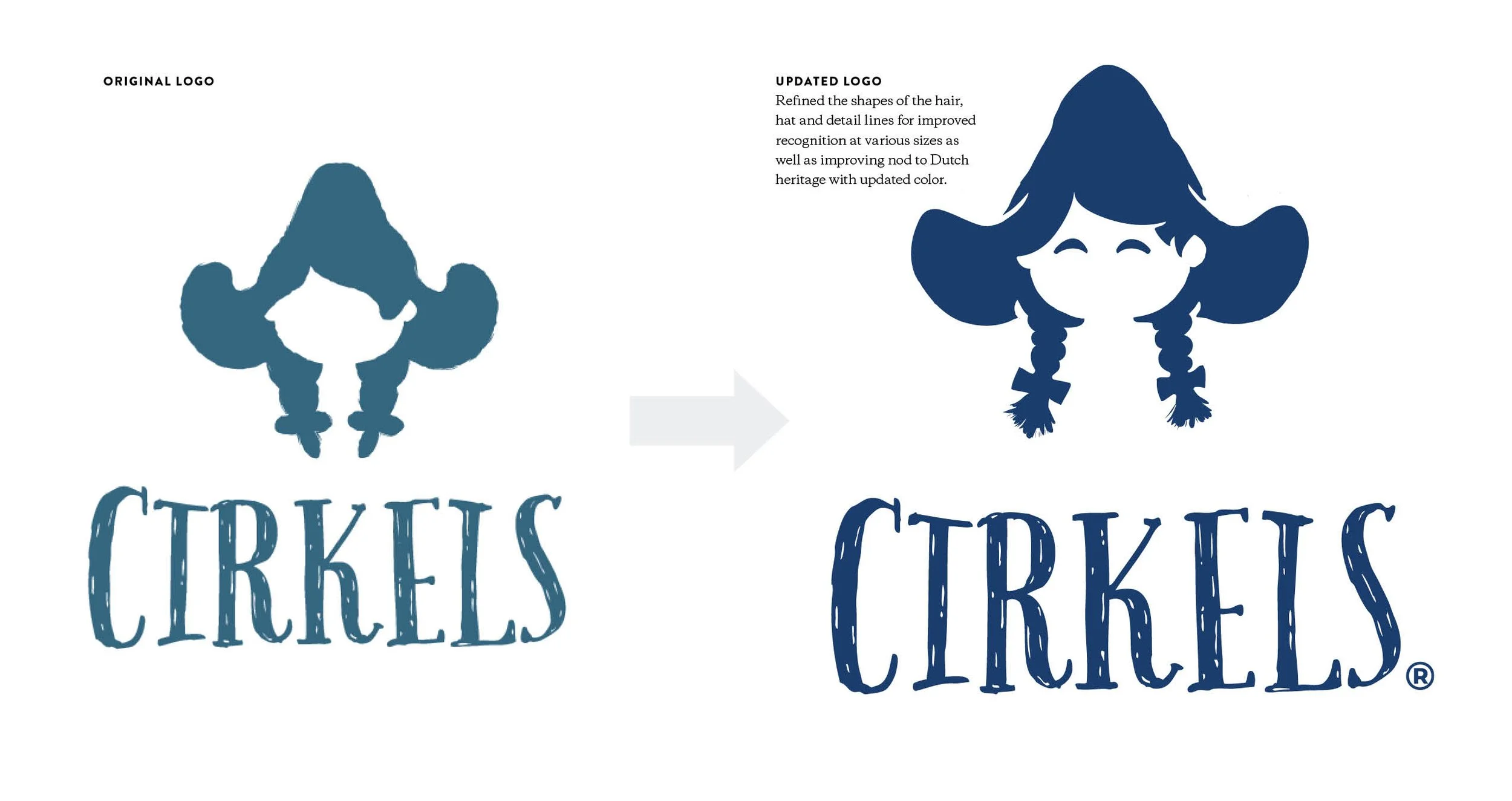
Cirkels Brand Refresh
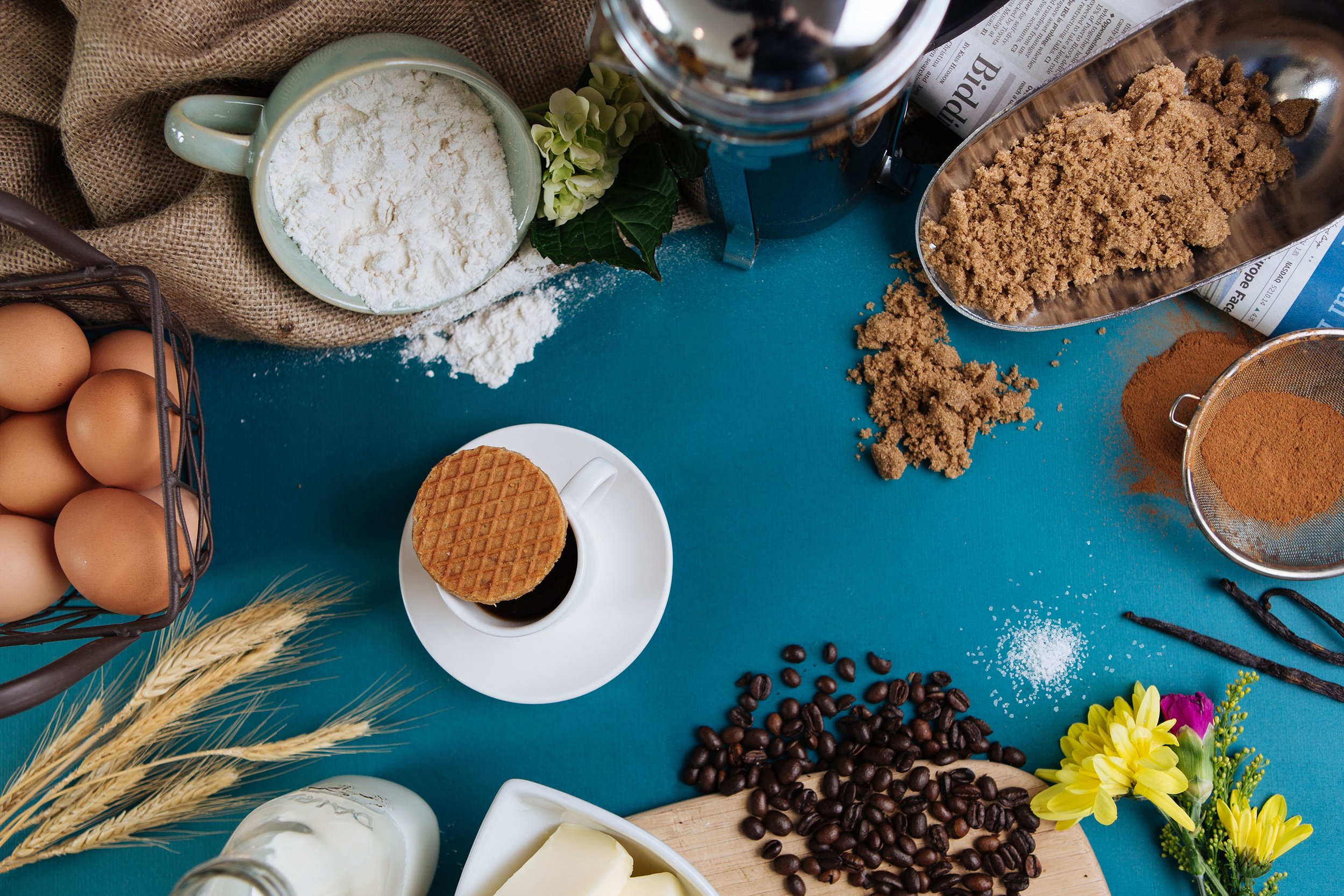
Cirkles came to us needing an update to their logo as their customers couldn’t tell that their icon was a little dutch girl. As we looked at the logo we discussed Cirkel’s branding and concluded they would benefit from a brand refresh. Primarily focusing on their visual identity we began adding in colorful illustrations that were a nod to the amazing ingredients that Cirkels used to make their award winning stroopwaffels. We created new photography, packaging, and helped establish a voice and tone for brand as well.
Client
Cirkels
Disciplines
Creative Direction, Design, Illustration
Project Partners
Dinng//Camille Nugent - Designer
Dinng//Katelyn Pettit - Designer